Centre Name: NORBURY MANOR BEC
Centre Number: 14343
Candidate Name: Usama Nadeem
Candidate Number: 8212
Unit: G321
Monday, 31 March 2014


Sunday, 23 March 2014
EVALUATION QUESTION 7: Looking back at your preliminary task, what do you feel you have learnt in the progression from it to the full product?
When looking back at the preliminary tasks that I did in the beginning of this course, I have noticed that my skills in Photoshop has massively increase throughout the course. You will be able to clearly see it when looking at the comparisons between my preliminary task and final music magazine.


Looking at the front covers of both the music magazine and preliminary task, you can already see a major difference between the two! Starting off with the preliminary task which is on the bottom, you can see the image that was taken had no photo manipulation towards it and also not editing what so ever. Also the cropping out of the image still left red outlines on it so it didn't look professional at all. The reason why the image had red outlines was due to the background the photo was taken on. However looking at the music magazine the photo has been well cropped leaving no marks behind because the image was taken in a white room with lighting around so it would've been easier to crop. I also used photo manipulation such as clone stamp and brightness tools which helped adjust the settings for the image to make it much more clear. Another thing that stands out between the two is the colour choice; in the music magazine you can see the colour choice being used simply as the same is applied for the preliminary task, however the font of the texts is much more clear and bold so it stands out better rather than the preliminary tasks. The layout has greatly improved as you can see the text is more spread out and put into sections with alignment as for the preliminary task the text was not aligned that great and also the text layout covered over the image which made it seems too crowded and difficult to read. The bleeds used in the preliminary task blended in with the image at first so it's hard to notice them until you fully look into the front cover. From that I avoided using bleeds as it wouldn't have benefited my music magazine.


When comparing the contents page for both the music magazine and preliminary task, you can again see another big difference between the two with good improvements using Photoshop. As you can see on the bottom which is the preliminary task I used two images with normal text and shapes to create a layout easy for the audience to read, however due to the colours used which were silver and white it blended in the words. Looking at the music magazine you can see that I wisely used the colours that I had from the front cover and put a grey boarder behind the text to make it look more affect and clear for the audience to read. Another thing that I did different was crop out images of the artists and put them together using a two shot form. New things I added in were graphics as you can see on the bottom right of the music magazine and the masthead logo which is represented next to the contents name. You can see the difference between both headings of contents as the music magazines heading is much more bigger and clear.
When comparing the two, I feel like I have developed a lot of skill in the software Photoshop. This is because of the tools I have now discovered which I didn't really know how to use beforehand when doing the preliminary task and feel like I know what to do now in the next time I construct a magazine using the software Photoshop. I also think that doing a preliminary when I was new to Photoshop was a great Idea to help me see how much progress I've made throughout the months of doing this course and using the music magazine front cover and contents page as another cover would be great when designing better things to keep me improving and making it more appealing towards audiences.
Looking at the front covers of both the music magazine and preliminary task, you can already see a major difference between the two! Starting off with the preliminary task which is on the bottom, you can see the image that was taken had no photo manipulation towards it and also not editing what so ever. Also the cropping out of the image still left red outlines on it so it didn't look professional at all. The reason why the image had red outlines was due to the background the photo was taken on. However looking at the music magazine the photo has been well cropped leaving no marks behind because the image was taken in a white room with lighting around so it would've been easier to crop. I also used photo manipulation such as clone stamp and brightness tools which helped adjust the settings for the image to make it much more clear. Another thing that stands out between the two is the colour choice; in the music magazine you can see the colour choice being used simply as the same is applied for the preliminary task, however the font of the texts is much more clear and bold so it stands out better rather than the preliminary tasks. The layout has greatly improved as you can see the text is more spread out and put into sections with alignment as for the preliminary task the text was not aligned that great and also the text layout covered over the image which made it seems too crowded and difficult to read. The bleeds used in the preliminary task blended in with the image at first so it's hard to notice them until you fully look into the front cover. From that I avoided using bleeds as it wouldn't have benefited my music magazine.
When comparing the contents page for both the music magazine and preliminary task, you can again see another big difference between the two with good improvements using Photoshop. As you can see on the bottom which is the preliminary task I used two images with normal text and shapes to create a layout easy for the audience to read, however due to the colours used which were silver and white it blended in the words. Looking at the music magazine you can see that I wisely used the colours that I had from the front cover and put a grey boarder behind the text to make it look more affect and clear for the audience to read. Another thing that I did different was crop out images of the artists and put them together using a two shot form. New things I added in were graphics as you can see on the bottom right of the music magazine and the masthead logo which is represented next to the contents name. You can see the difference between both headings of contents as the music magazines heading is much more bigger and clear.
When comparing the two, I feel like I have developed a lot of skill in the software Photoshop. This is because of the tools I have now discovered which I didn't really know how to use beforehand when doing the preliminary task and feel like I know what to do now in the next time I construct a magazine using the software Photoshop. I also think that doing a preliminary when I was new to Photoshop was a great Idea to help me see how much progress I've made throughout the months of doing this course and using the music magazine front cover and contents page as another cover would be great when designing better things to keep me improving and making it more appealing towards audiences.
EVALUATION QUESTION 6: What have you learnt about technologies from the process of constructing this product?
Make your own mind maps with Mindomo.
EVALUATION QUESTION 5: How did you attract/address your audience?
Click on the images which are directly below for annotations leading to Flickr on how I managed to attract and address my audience. (Due to limitations on the website "Flickr" an account will be required to log in and view the annotations)


EVALUATION QUESTION 3: What kind of media institution might distribute your media product and why?
Evaluation 3
More PowerPoint presentations from Usama Avenged Nadeem
EVALUATION QUESTION 2: How does your media product represent particular social groups?
(Speech from Voki)
The way my media product represents particular social groups was through the way I had advertised names of other big artists on the music magazine for UP also known as Underground Publicity. The names of the artists were, Eminem, MGK, The Game, 50 Cent and Hopsin.
These artists fit in well with the age group which is aged around 16 to 20. When creating the magazine I looked back at my survey, this helped me get results to add in and construct the music magazine. The way I managed to make it relate to the audience was through the layout of the front cover and contents page. I managed to also use a simple amount of colours to make it relevent to the group age rather than making it more colourful to make it seem out of place in not being the right type of music magazine for the certain target audience.
Thursday, 20 March 2014
Wednesday, 19 March 2014
DPS - Final Double Page Spread Complete

DPS - Adding in some graphics

Following on from the contents page when I used the arrow graphics. To continue this I decided to use another arrow to follow on from its own originality to show the readers to turn the page. Looking back at my surveys the audience did recommend having at least a few graphics but making sure not to over do it. So in order to do this I created the arrow and red background following on from the colours and then merged it to drag onto photo shop. From this It let me easily put it on the bottom right corner of the page so it is in the right position.
DPS - Photoshopping using clone stamp

After adding in the pictures onto the DPS, I used some of the softwares to edit the pictures so it's more clear and professional for the audience to see. So what I did was to use the clone stamp tool to remove any spots or from the artists and shade a bit of the lighting to make it a bit more brighter than usual.
Here is a picture after I was done.

As you can see, the picture of the artist is now much more clear and more visual to see as I've used the tools from photoshop to create this.
DPS Layout

Following on from this I then began to add in more. But since the DPS flat plan that I had didn't quite fill what I needed I decided to go back to my research on the DPS and use Ideas from the magazines I looked at which were XXL, Vibe and The source and this is how the layout has changed.

As you can now see, I've changed the layout to a similar layout with professional music magazines, however to keep original I did something different which was put the music magazines logo on the left corner just underneath the text and extend the main heading through out the whole page. I also added in the issue month and year and what inspired me to do this was use my research on DPS which i got from the XXL magazines DPS. Another thing I added was an arrow graphic which followed on from the contents page to add some originality in to indicate the audience to turn the page over. I've also got online weblinks for the any of the readers that are interested to continue reading on and finding out new articles online.
Research: Interview Writing + Interview with Artist.
I went through a couple of magazines mainly rap and hip hop genre magazines to see how interviews were on the double page spreads for those magazines. The main ones I look at were from XXL and Vibe as they stood out the most for me. What I'm planning to do for my DPS is include the same colour scheme as the clothing used by the artists for the images. As you can see from my Images choices I've already made the artist resemble colours from the magazine which were; Red, black, white and Grey.
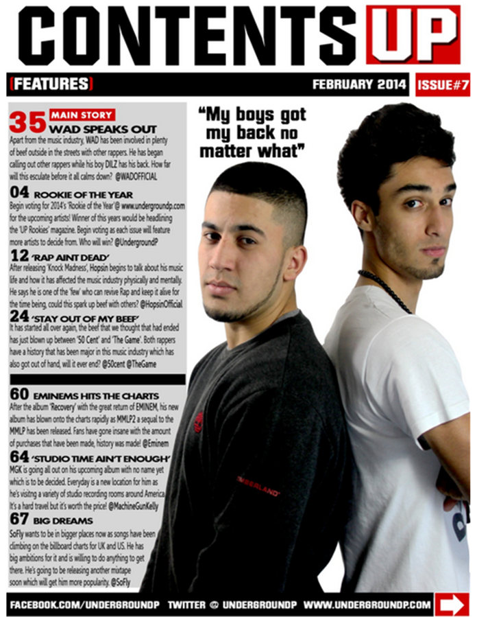
Interview with WAD:
Recently, there has been a lot of hype going on in the music industry, inside and outside. We’ve managed to grab one of the main artists involved in this hype to see what has been going on and what will all of this conclude to. Here are the following questions we asked including the answers from the artist.
What’s going on with the struggle?
After winning last year’s “Rookie of the Year”, I began making a name for myself not just regionally but globally. This then led onto becoming more respected and appreciated by other artists and fans, so I thought it was all settled and everything would be great. I managed to climb up and bring in my boy DILZ – however, it began to spark beef in the music industry with other artists. Just because DILZ and I were doing our own thing,it somehow became a game where others can hate on us while we’re trying to reach success.This got me to a pivotal moment thinking ‘what should I do now?’I have never been involved in this kind of difficult situation before, it’s literally the first time. However to all the artists out there, I’d just like to say I’m not afraid.
What’s DILZ role in this?
You know, he’s been my boy since day one. He literally helped me so much with my success, to reach the point of where I’m at now. He’s also helped out with what has been going on since. What still gets me is that he’s still here trying his best to help me out and sort out the problem which proves his loyalty as a best friend. I need to find more people like that and I know most of my fans probably have a personality that is based around supporting me and helping me out.
What’s the next step you’re going to take?
The next step I’m going to take is to clear my name in this music industry. I don’t want to be seen as a fraud or cheater - if I just let this slide, then it’s just going to become an automatic name that people use to refer to me as. And dealing with that while trying to make a name for myself will be an extremely tough position to be in and all I can say right now is that I cannot stomach that.
Who have you called out so far?
The people who have been on my case ever since these rumours started are the group called “Young Hustles”. I know for a fact with my verbal skills with DILZ in the booth I can make one of the best diss tracks possible to fire back at them. Doing this will shut them up and teach them a lesson to stay away from twisting rumours around and if they still don’t learn then they’ll have to learn it the hard way. This goes out to anyone else that tries to get involved because enough is enough already.
What are your plans for the future in the music industry?
My future plans are to go around the world touring in different places, meeting my fans, appreciating them for their time in coming to see me and also hope for the best in future music awards. Another thing I’m looking forward to is my album that I’m currently recording but it has been delayed due to the beef. But do not worry; it should be back on track once everything is sorted out.
Looking at good rumours, apparently you’re forming a group. Is that true?
Now that’s a rumour we can both agree on. It’s true that I’m going to be forming a group soon. It is most likely going to start off with me and DILZ. We’ve got a few other rappers who are willing to join it and hopefully they’ll be committed and loyal to the group so it can actually get somewhere. What I’m looking forward to the most though is touring with the guys.
What has inspired you to do that?
Well when I was younger I’d listen to a rap group called N.W.A and they’ve influenced me ever since to make a rap group of my own. Hopefully it’s successful and another group that has truly inspired me is D12. Just saying it now, Eminem is one of the best rappers alive and one of the people who inspired me to write music as a young teen.
Before we finish off, would you like to say anything to your fans?
To my fans, you guys have helped me so much to get me where I am now, and with what is going on now I hope you guys don’t believe it because most of it is lies. Don’t feel betrayed or lost over this because trust me, I’m telling you now It’s all a hoax that has been set up by other rappers jealous of where I’m getting with you guys. So keep it real and stay tuned for the upcoming album. Hopefully I’ll be touring near you soon!
Friday, 7 March 2014
Contents Page Feedback

Viewer 1: The way you have constructed the contents page looks so amazing and worth it! The pictures have been cut out very well so there is no messy lines around it and it has been well structured with the text, I can also see that you have aligned the text with the numbers and also put in certain features which makes it stand out.
Viewer 2: This magazine contents page looks very professional, however before we continue may I say that you could have added more pictures and maybe more features into the magazine. Other than that It looks well organised and good and it also follows the same colour and text for the front cover. The image also follows up with the quote from the magazine relating to the news about the certain artists which looks very eye catching.
Viewer 3: Man, this is pretty good i'm not going to lie, I thought it would be a bit different and lower than i expected. You should keep up the work I like the image of the two artists and how they have posed in the medium shot from the camera shoot. The angle of gaze continues to catch my attention following from the front cover. Also I love how you have kept out originality in the magazine by having the logo in the top right.
Beth: You have used up your space well, you have also kept up to the colours of the front cover but there's some white gaps that expose the background too much which could have been filled in. And also I like how the pictures connects with the quote. Also the way you have photo shopped their faces was pretty good! The page numbers are all the same size, which makes the page look structured.
Contents Page Text/Features/Colour choices


Contents Page Layout


Thursday, 6 March 2014
Deconstruction of Contents Page + Research (moodboard)


In this mood board, I gathered a few contents pages from two magazines which share similar genres which are called XXL and Vibe. Looking at the contents pages, you can see from each side they have their own type of layout for most of their magazines. For example, the way the headings are for the contents page in XXL and then for Vibe it's mainly with the V symbol in the background or on the side. Also in Vibe magazine the image of the artists are enlarged and take up most of the contents page, as for XXL it's a bit similar however, it is taking up half of the space to keep the text aligned.
Sunday, 23 February 2014
Front Cover Target Audience Feedback

Since I completed the front cover for my magazine, I decided to interview a few of those who took part in my survey and those who are apart of the target audience to see what their thoughts were on the magazine.
"Rapper named Content" - The front cover of "Up" Magazine is a very well designed page. The theme of the work is easily seen throughout the cover, from top to the bottom. On each side you see titles and stories that captivate the reader, therefore you want to read more and find out what's going on in the lives of rappers.
"Viewer 2 (Didn't want name mentioned)" - From what I saw before as the draft plan to what I see now, it looks like the plan has worked out very well! I love how you've added a better font for the masthead to make it look more rough and realistic for rap rather than having something smooth and soft which is more related towards pop. Also the effected used on the text such as shades, italics and boldness all work well with the magazine. One thing about the magazine is that you should space out the text a bit more from the length, it's always good to have some negative feedback to fix up from! :)
"Viewer 3 (Didn't want name mentioned)" - Looks nearly as professional as XXL would have their magazines!! I really like the image of the artists as it looks really appealing with the eyes looking right at me. It somehow automatically drags me in and draws my attention. Another good thing is the logo in the background the way it's been placed behind the image of the artist makes it look more original rather than it being in front. The price always looks very consuming for a magazine like that. So a job well done to this!
"James (a friend)" - Dude, how long did this take to make?? It looks so well organised and prepared, I honestly love rap and this looks like the suitable magazine for me and my needs when it comes down to music, I really like the main heading you have of the rappers name and the slogan underneath it, it's really eye-catching also the text used makes it look more underground something i think you were going for with the feedback you got me so it's good to see you used that and keep up the working hoping to see more good things.
Front Cover Linked to Research
When making the front cover, I mainly wanted to resemble my front cover to the XXL magazines especially the one with the artists NAS on it. This was due to the colour and lighting using including mise-en-scene. So what I did was make the font similar however, use a different masthead "UP" with effects to make it look much different and then use the ideas from the XXL magazine and create my own with graphics, colours, text and layers. I also looked at other music magazines such as VIBE and The Source, but the one that appealed to me the most was XXL. This was due to the target audience that I had and also the way it's been laid out so simply and formally rather than being over done with a younger audience.


As you can see, most of my research was based upon that magazine, however the things I changed in the text were, the main heading slogan to make it shorter and catchier towards the target audience also the name of the magazine on top of the masthead "UP" so the audience will know the name of the magazine not just the initial if it ever comes to newcomers.
As you can see, most of my research was based upon that magazine, however the things I changed in the text were, the main heading slogan to make it shorter and catchier towards the target audience also the name of the magazine on top of the masthead "UP" so the audience will know the name of the magazine not just the initial if it ever comes to newcomers.
Front Cover Features
Since the front cover was hardly going to have features such as graphics due to the age group to make it seem less young teenish, I decided to add a few red lines and a plus sign to the magazine as the graphics as I didn't want to over do it due to the age range which was around 16-20. In this image you would see where these graphics have been placed to make it seem reasonable and more formal for the genre hence why I didn't want to add graphics such as stars etc due to that making it more hip hop/pop.

When using the lines in the front cover, I duplicated the layers to keep it a precise length rather than making it odd lengths, after that I managed to line out the text from each side to keep it in shape and together. I also added a price tag and lined out the bar code to the side as planned from the final draft plan as it's located on the bottom right page of the front cover. I used the price "2.99" due to business marketing schemes as it looks more effective and appealing that "3.00" putting thoughts into the consumers mind by making it look cheaper although it's a penny short. Also this price range was selected by the target audience which most would purchase it by.
When using the lines in the front cover, I duplicated the layers to keep it a precise length rather than making it odd lengths, after that I managed to line out the text from each side to keep it in shape and together. I also added a price tag and lined out the bar code to the side as planned from the final draft plan as it's located on the bottom right page of the front cover. I used the price "2.99" due to business marketing schemes as it looks more effective and appealing that "3.00" putting thoughts into the consumers mind by making it look cheaper although it's a penny short. Also this price range was selected by the target audience which most would purchase it by.
Masthead and Font Decisions
When it came to choosing a font I had various decisions on which one to choose, however I first made a template of a few example ones then showed them to the target audience to see which one they preferred and these were the ones shown.

However this wasn't enough for text as it wasn't rough and underground enough to make it feel like it was a rap and hip hop magazine so I decided to then go through some more texts until I came to one that actually had more of a cunning edge that satisfied the needs of the target audience to know and feel that it was a rap and hip hop magazine. (This picture of the masthead is taken from the front cover while being made)

However this wasn't enough for text as it wasn't rough and underground enough to make it feel like it was a rap and hip hop magazine so I decided to then go through some more texts until I came to one that actually had more of a cunning edge that satisfied the needs of the target audience to know and feel that it was a rap and hip hop magazine. (This picture of the masthead is taken from the front cover while being made)
After using this font for the magazine I also then added a shadow to make it more effective and stand out more so it looks original. The mastheads plan was originally planned for the artists image to cover up half of the P however, since it would disguised and confuse the audience in not knowing the name of the magazine I decided to bring out the P a bit more so it's more clear to the audience and viewers of this type of genre.
Photograph Manipulation
When I had the image cut out and put onto the front cover, there were a few things I needed to change in the picture to make it look more appealing due to the features and lighting that didn't come out that well as planned. What I decided to do was use the stamp tools to go over some face features and then use the contrast and brightness to create an effect on the image to make it look more lighter and appealing as I received some feedback from some apart of the audience saying out the image looked dull in the beginning, so after playing around with the brightness and contrast I came to this conclusion also after making the face more smoother.


Before:
After: (settling the brightness and contrast of the image)
Cover Layout & Photoshop (the creation begins)
Now that I'm moving on to design the front cover, I started laying out the front cover using an A4 template on Photoshop with custom settings to make the page size resolution a perfect length. I started out by selecting the image I'll be using from the images I took earlier then cropping it out using the tool named "magnetic lasso" shown in this picture.

Moving on from this, I then opened up the front cover page and put up an image of the final flat plan as the background so I can begin to use that as a template to where everything will go then added a few quick random text to see if everything would fit into the image as planned. (Bear in mind the text was quickly used then was improved and edited later on)

This is how it looked with the final flat plan in the background then a few layers added on with the image.
Moving on from this, I then opened up the front cover page and put up an image of the final flat plan as the background so I can begin to use that as a template to where everything will go then added a few quick random text to see if everything would fit into the image as planned. (Bear in mind the text was quickly used then was improved and edited later on)
This is how it looked with the final flat plan in the background then a few layers added on with the image.
Shots taken including "Mise-en-scene" (Final front cover shots)


Most of the shots used in these pictures have been presented as medium shots as that was chosen to be the final decision by the target audience. For the props I used the silver chain and black hoody as a part of the genre stereotype since it's based around rap and hip hop including a harder look than a softer one to make it look more appealing . I also got the artists to use the angle of gaze in all the pictures so it draws attention straight away to the audience. I put the lighting in various ways to put a shading towards to the white background and lighting on the artists face that way it can make a different affect rather than using a straight forward one.
Test Shots
Here are some test shots I took from different angles for the front cover of the magazine. In these shots I was mainly looking for shots such as; medium close up shots, medium shots, close ups & extreme close ups to see how the concept of the images would affect the magazine using the feedback I received from those who took part in my surveys and also feedback.

Also using mise-en-scene for the test shots I used the same outfit I would be using for the final front cover image which was jewellery and a black hoody to match the colours used in the magazine. As you can see from this the test shots have been proceeded well with shady backgrounds from the lighting which would be used in the final front cover of the magazine.
Also using mise-en-scene for the test shots I used the same outfit I would be using for the final front cover image which was jewellery and a black hoody to match the colours used in the magazine. As you can see from this the test shots have been proceeded well with shady backgrounds from the lighting which would be used in the final front cover of the magazine.
Sunday, 2 February 2014
Draft Flatplan with feed back


Draft flat plan Feedback. (This feedback was taken from social networking sites such as Facebook and twitter after showing the draft flat plans to some of the audience. Identities have been hidden for personal reasons)
Viewer 1: I like how the colour has been presented in this front cover. It actually makes it stand out more compared to other magazines as red is a vital colour used by big magazine companies in the industry. Another thing I like about this is the fact that the contents page is laid out simply with an image of two artists being put next to each other as it shows us who would be featured and what will be exclusive content.
Viewer 2: I like the masthead as it reminds me of XXL which the draft plan was originally meant to be resembling and also how the sub headings have been cleared to the side so it doesn't disturb the image of the main artists. The size of the text has been used wisely showing the audience what are the sub headings and which are the main headings. Also the angle of gaze used by the main image of the artist is very appealing and it looks like it's looking right at us to drag us in and consume what is there.
Viewer 3: This draft plan looks like it has been put in with a lot of hard work and dedication. The layout and setting is extremely clear as it's representing the genre rap and hip hop. I think that the artist has been given the right props as it's showing how they are in reality. This gives the image of rappers being tough and aggressive towards things. Also the colour has been very appealing and the price is very suitable for the content it'll be giving.
Shot, Location and Prop List.
Shots:
For the type of shots, I'll be using a few such as; Medium Close Up, Medium Shots and Long shots of the artists that will be featured in the magazine. These type of shots have been drawn onto the draft plan front cover, contents page and double page spread.


Location:
The place we're I'm going to take the pictures will be located around brick wall type of areas which may have graffiti around them to add the affect of the ghetto side due to the genre making it look rough. Some ideas of places can be seen in these pictures.

Prop List:
The props I'll be using will be gangster/bad boy based. This will include jewellery, snap back, hoodies and so on. It will have a full on Rap and Hip Hop theme for the magazine with the artists posing with that type of clothing here are some examples of what they'll be wearing.


For the type of shots, I'll be using a few such as; Medium Close Up, Medium Shots and Long shots of the artists that will be featured in the magazine. These type of shots have been drawn onto the draft plan front cover, contents page and double page spread.
Location:
The place we're I'm going to take the pictures will be located around brick wall type of areas which may have graffiti around them to add the affect of the ghetto side due to the genre making it look rough. Some ideas of places can be seen in these pictures.
Prop List:
The props I'll be using will be gangster/bad boy based. This will include jewellery, snap back, hoodies and so on. It will have a full on Rap and Hip Hop theme for the magazine with the artists posing with that type of clothing here are some examples of what they'll be wearing.
Subscribe to:
Comments (Atom)