Centre Name: NORBURY MANOR BEC
Centre Number: 14343
Candidate Name: Usama Nadeem
Candidate Number: 8212
Unit: G321
Monday 31 March 2014


Sunday 23 March 2014
EVALUATION QUESTION 7: Looking back at your preliminary task, what do you feel you have learnt in the progression from it to the full product?
When looking back at the preliminary tasks that I did in the beginning of this course, I have noticed that my skills in Photoshop has massively increase throughout the course. You will be able to clearly see it when looking at the comparisons between my preliminary task and final music magazine.


Looking at the front covers of both the music magazine and preliminary task, you can already see a major difference between the two! Starting off with the preliminary task which is on the bottom, you can see the image that was taken had no photo manipulation towards it and also not editing what so ever. Also the cropping out of the image still left red outlines on it so it didn't look professional at all. The reason why the image had red outlines was due to the background the photo was taken on. However looking at the music magazine the photo has been well cropped leaving no marks behind because the image was taken in a white room with lighting around so it would've been easier to crop. I also used photo manipulation such as clone stamp and brightness tools which helped adjust the settings for the image to make it much more clear. Another thing that stands out between the two is the colour choice; in the music magazine you can see the colour choice being used simply as the same is applied for the preliminary task, however the font of the texts is much more clear and bold so it stands out better rather than the preliminary tasks. The layout has greatly improved as you can see the text is more spread out and put into sections with alignment as for the preliminary task the text was not aligned that great and also the text layout covered over the image which made it seems too crowded and difficult to read. The bleeds used in the preliminary task blended in with the image at first so it's hard to notice them until you fully look into the front cover. From that I avoided using bleeds as it wouldn't have benefited my music magazine.


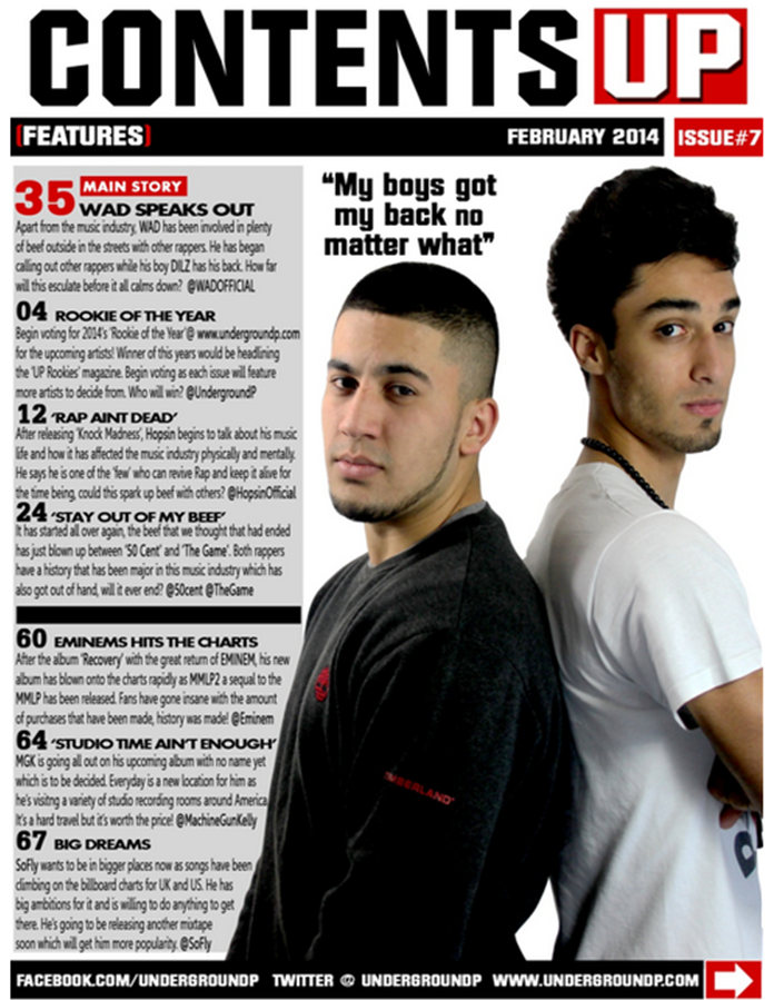
When comparing the contents page for both the music magazine and preliminary task, you can again see another big difference between the two with good improvements using Photoshop. As you can see on the bottom which is the preliminary task I used two images with normal text and shapes to create a layout easy for the audience to read, however due to the colours used which were silver and white it blended in the words. Looking at the music magazine you can see that I wisely used the colours that I had from the front cover and put a grey boarder behind the text to make it look more affect and clear for the audience to read. Another thing that I did different was crop out images of the artists and put them together using a two shot form. New things I added in were graphics as you can see on the bottom right of the music magazine and the masthead logo which is represented next to the contents name. You can see the difference between both headings of contents as the music magazines heading is much more bigger and clear.
When comparing the two, I feel like I have developed a lot of skill in the software Photoshop. This is because of the tools I have now discovered which I didn't really know how to use beforehand when doing the preliminary task and feel like I know what to do now in the next time I construct a magazine using the software Photoshop. I also think that doing a preliminary when I was new to Photoshop was a great Idea to help me see how much progress I've made throughout the months of doing this course and using the music magazine front cover and contents page as another cover would be great when designing better things to keep me improving and making it more appealing towards audiences.
Looking at the front covers of both the music magazine and preliminary task, you can already see a major difference between the two! Starting off with the preliminary task which is on the bottom, you can see the image that was taken had no photo manipulation towards it and also not editing what so ever. Also the cropping out of the image still left red outlines on it so it didn't look professional at all. The reason why the image had red outlines was due to the background the photo was taken on. However looking at the music magazine the photo has been well cropped leaving no marks behind because the image was taken in a white room with lighting around so it would've been easier to crop. I also used photo manipulation such as clone stamp and brightness tools which helped adjust the settings for the image to make it much more clear. Another thing that stands out between the two is the colour choice; in the music magazine you can see the colour choice being used simply as the same is applied for the preliminary task, however the font of the texts is much more clear and bold so it stands out better rather than the preliminary tasks. The layout has greatly improved as you can see the text is more spread out and put into sections with alignment as for the preliminary task the text was not aligned that great and also the text layout covered over the image which made it seems too crowded and difficult to read. The bleeds used in the preliminary task blended in with the image at first so it's hard to notice them until you fully look into the front cover. From that I avoided using bleeds as it wouldn't have benefited my music magazine.
When comparing the contents page for both the music magazine and preliminary task, you can again see another big difference between the two with good improvements using Photoshop. As you can see on the bottom which is the preliminary task I used two images with normal text and shapes to create a layout easy for the audience to read, however due to the colours used which were silver and white it blended in the words. Looking at the music magazine you can see that I wisely used the colours that I had from the front cover and put a grey boarder behind the text to make it look more affect and clear for the audience to read. Another thing that I did different was crop out images of the artists and put them together using a two shot form. New things I added in were graphics as you can see on the bottom right of the music magazine and the masthead logo which is represented next to the contents name. You can see the difference between both headings of contents as the music magazines heading is much more bigger and clear.
When comparing the two, I feel like I have developed a lot of skill in the software Photoshop. This is because of the tools I have now discovered which I didn't really know how to use beforehand when doing the preliminary task and feel like I know what to do now in the next time I construct a magazine using the software Photoshop. I also think that doing a preliminary when I was new to Photoshop was a great Idea to help me see how much progress I've made throughout the months of doing this course and using the music magazine front cover and contents page as another cover would be great when designing better things to keep me improving and making it more appealing towards audiences.
EVALUATION QUESTION 6: What have you learnt about technologies from the process of constructing this product?
Make your own mind maps with Mindomo.
EVALUATION QUESTION 5: How did you attract/address your audience?
Click on the images which are directly below for annotations leading to Flickr on how I managed to attract and address my audience. (Due to limitations on the website "Flickr" an account will be required to log in and view the annotations)


Subscribe to:
Posts (Atom)